BUBUSAN
Client: Plan Do See
Born out of necessity during the height of the COVID-19 pandemic, BUBUSAN was a fast, rebellious pivot for a hospitality group known for fine-dining elegance. Positioned as the “bad little brother” of the Michelin-recognized AZABU, BUBUSAN delivered the same level of culinary precision but in a delivery-friendly format built for the times.
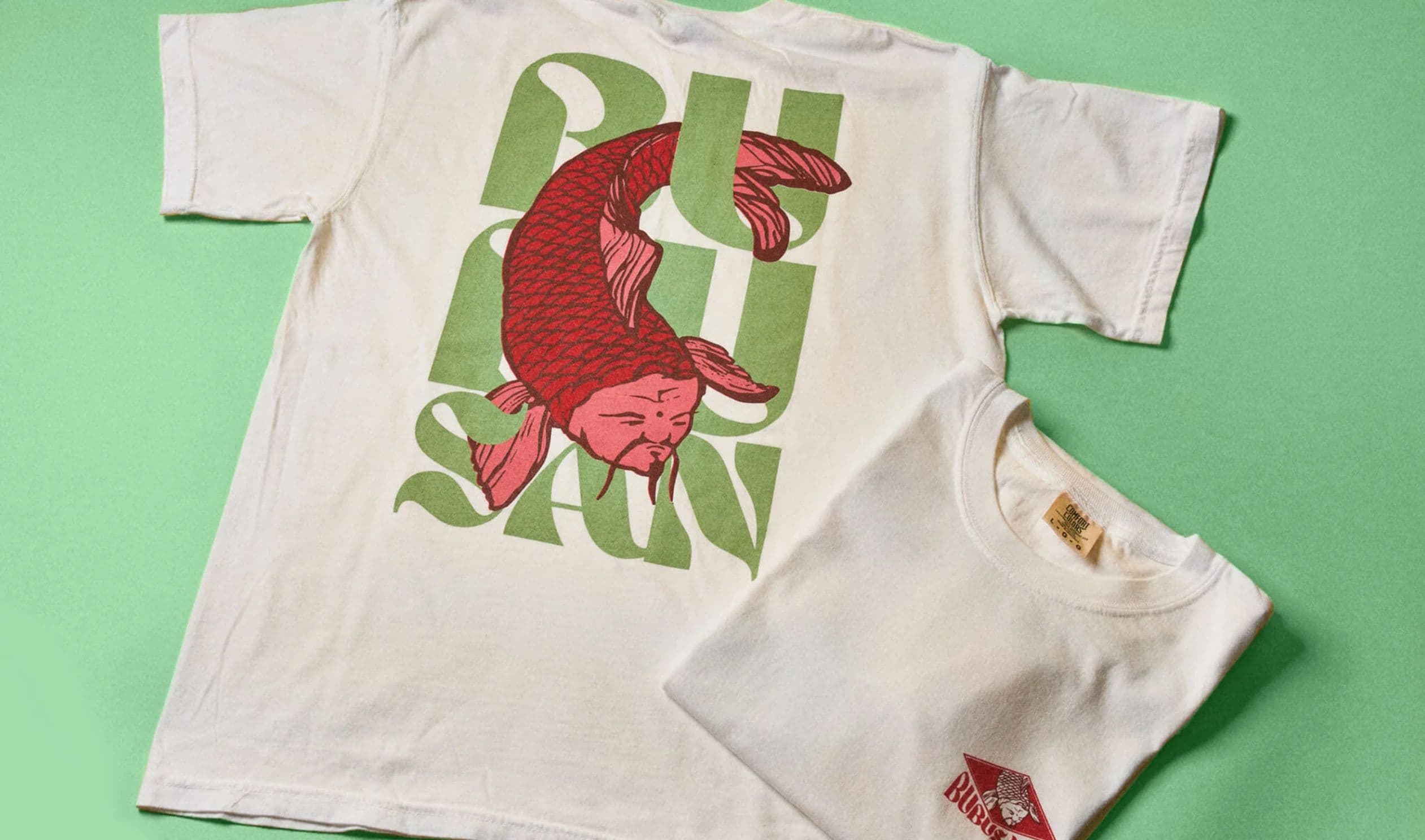
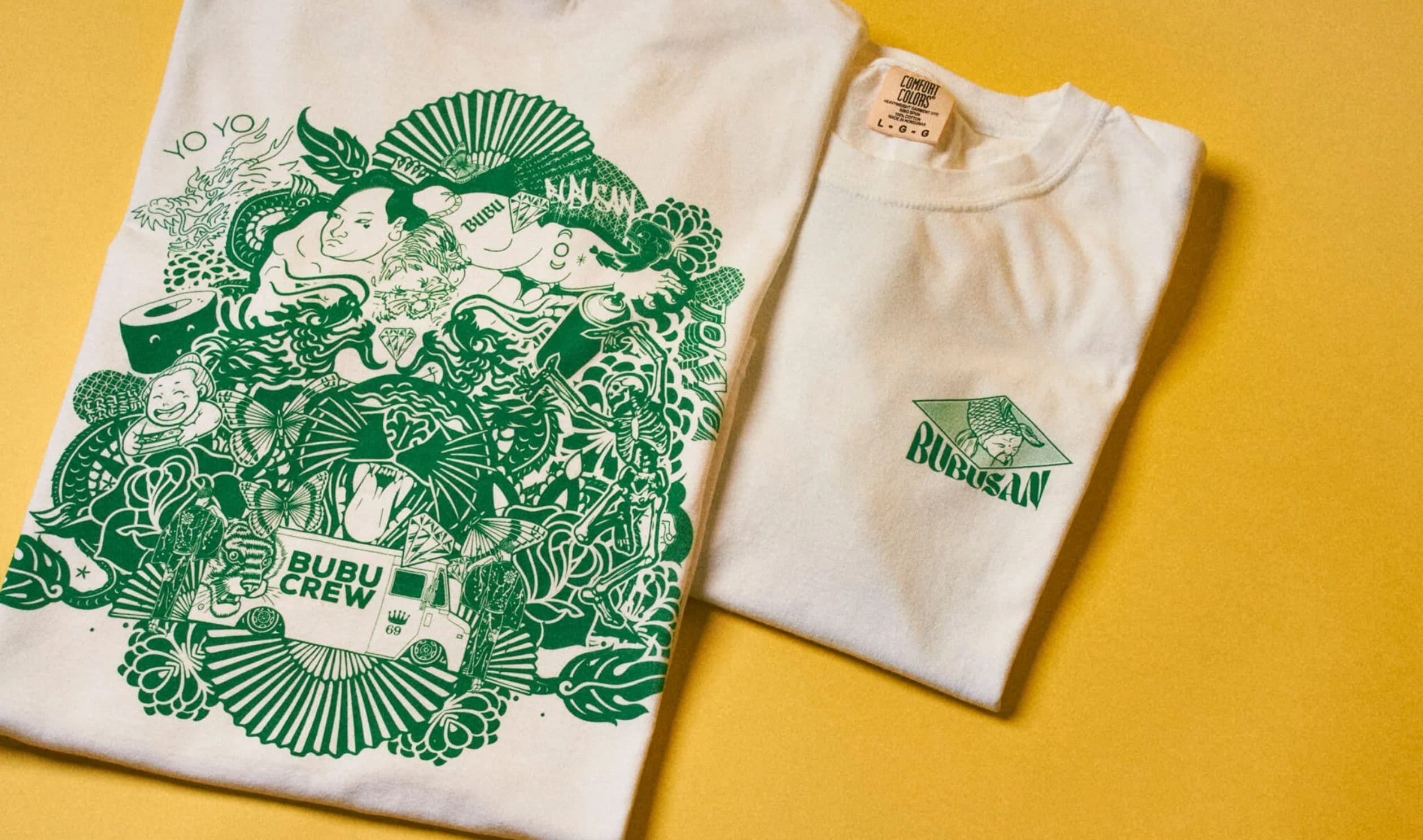
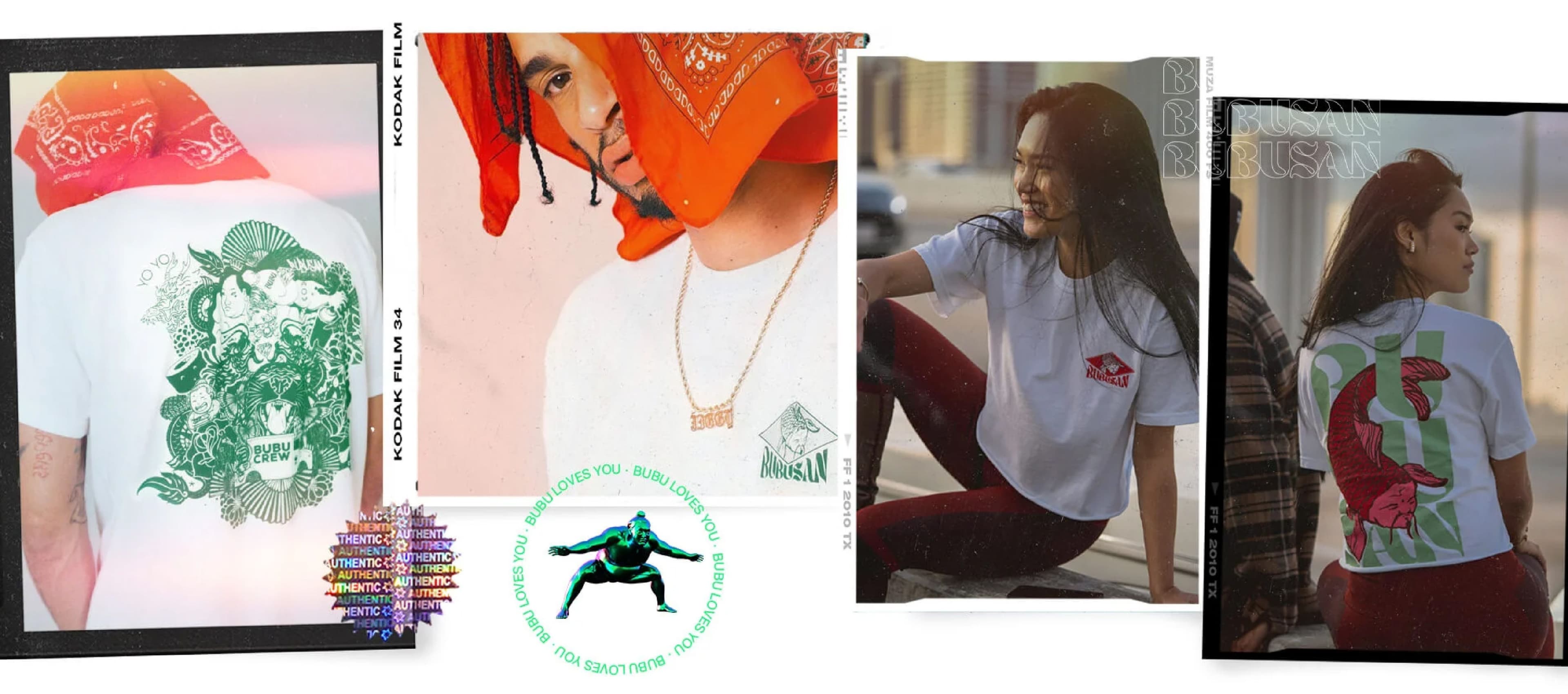
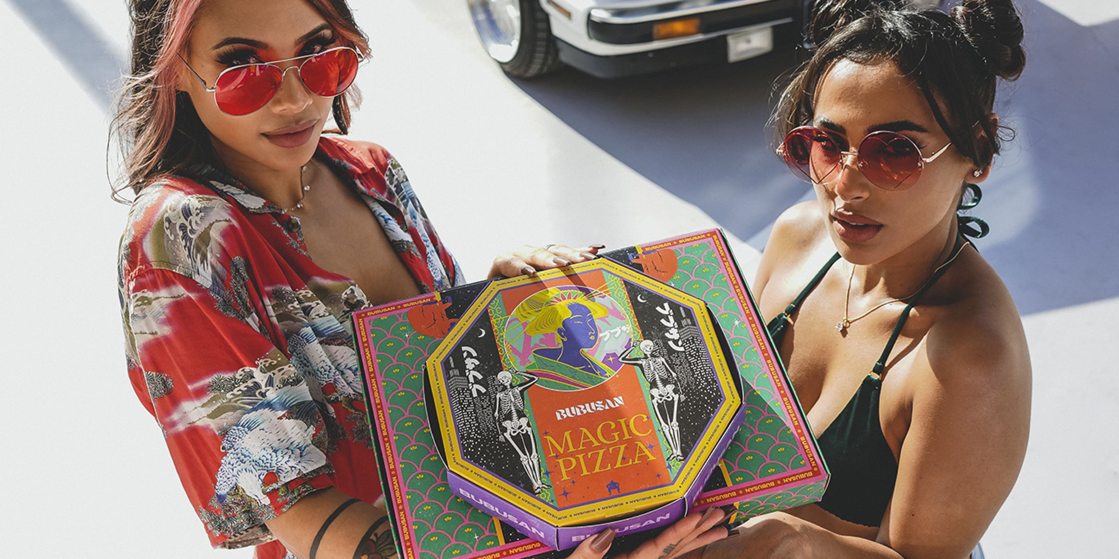
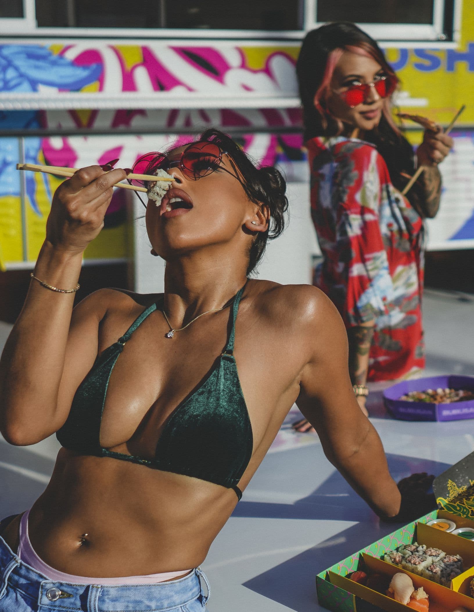
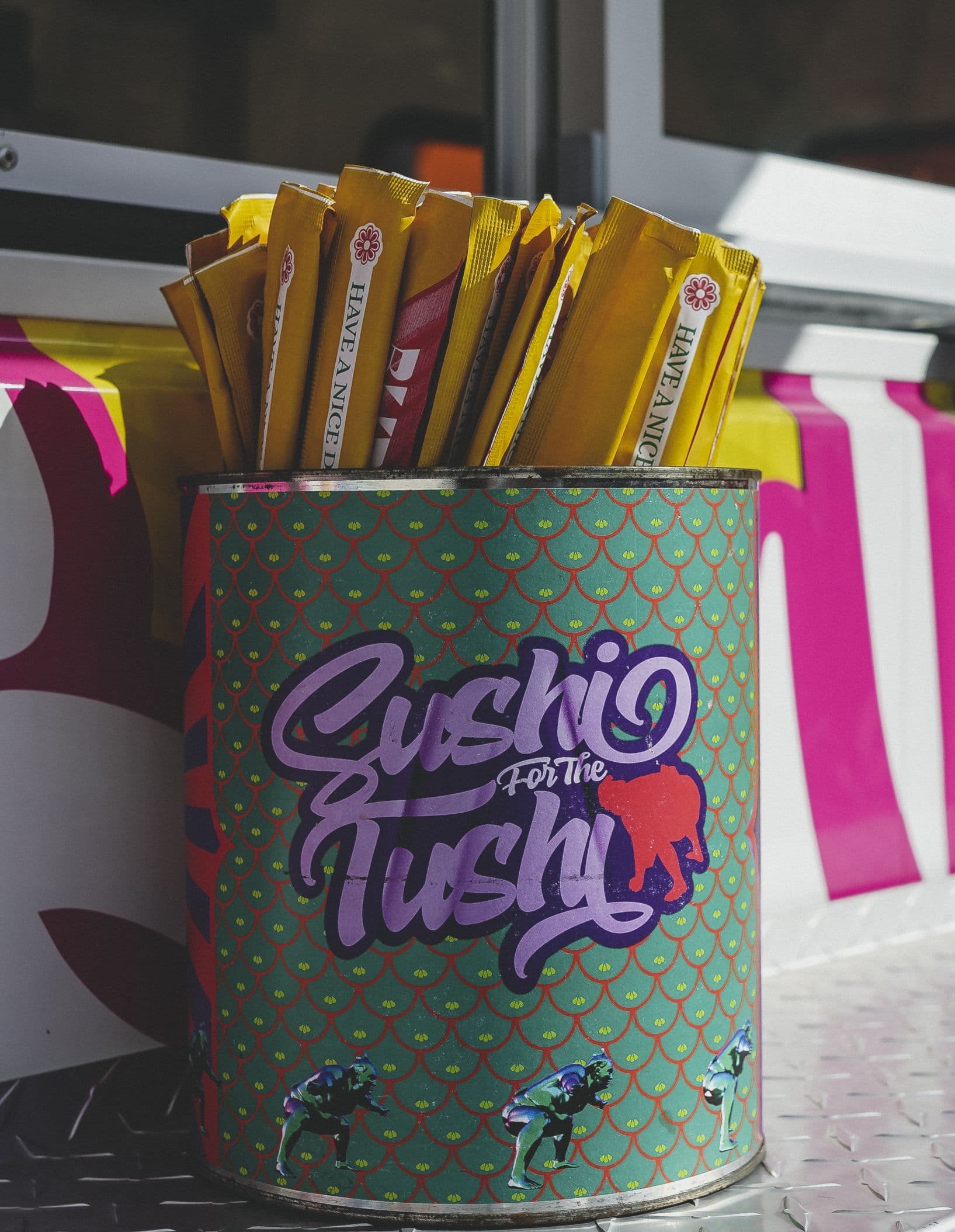
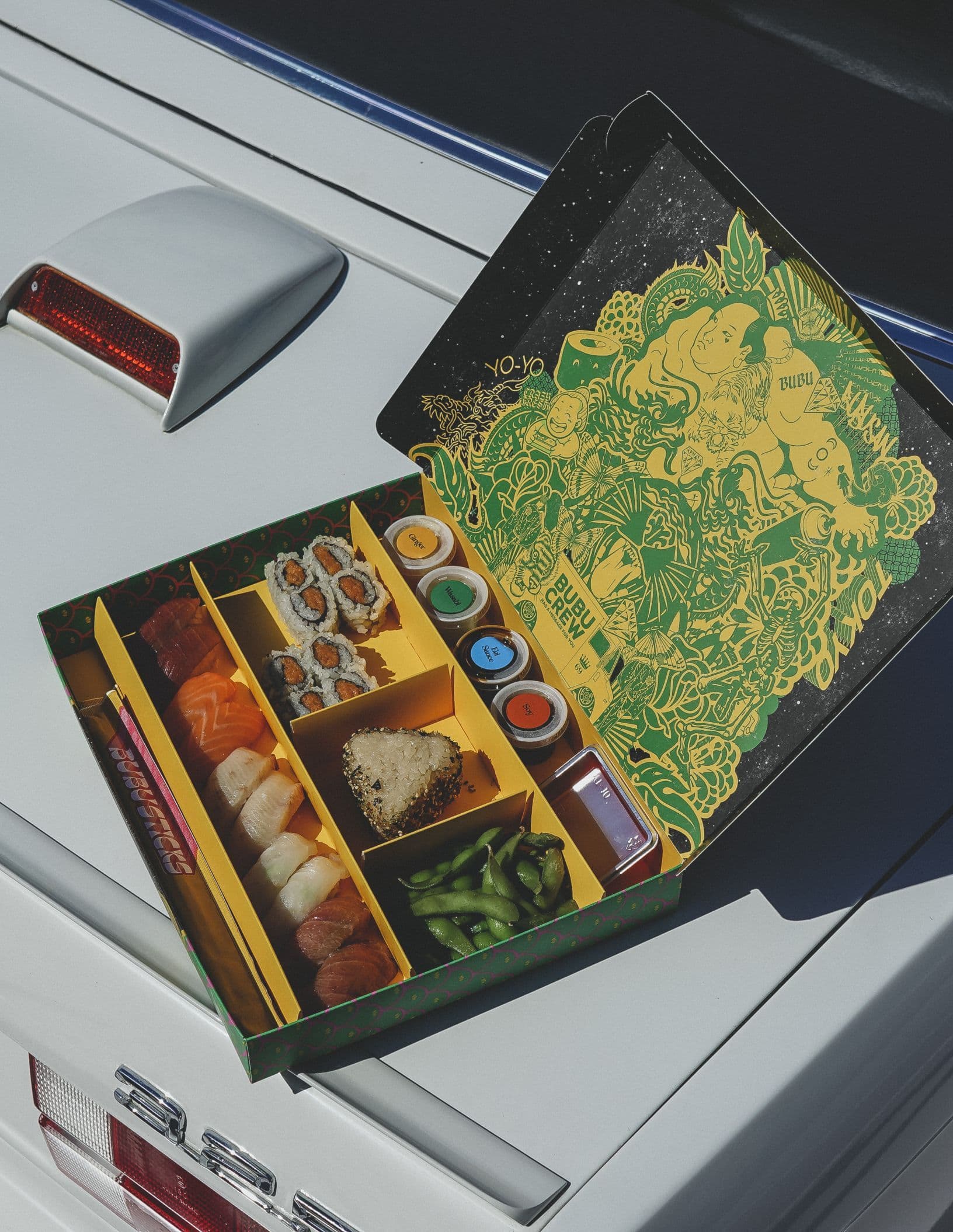
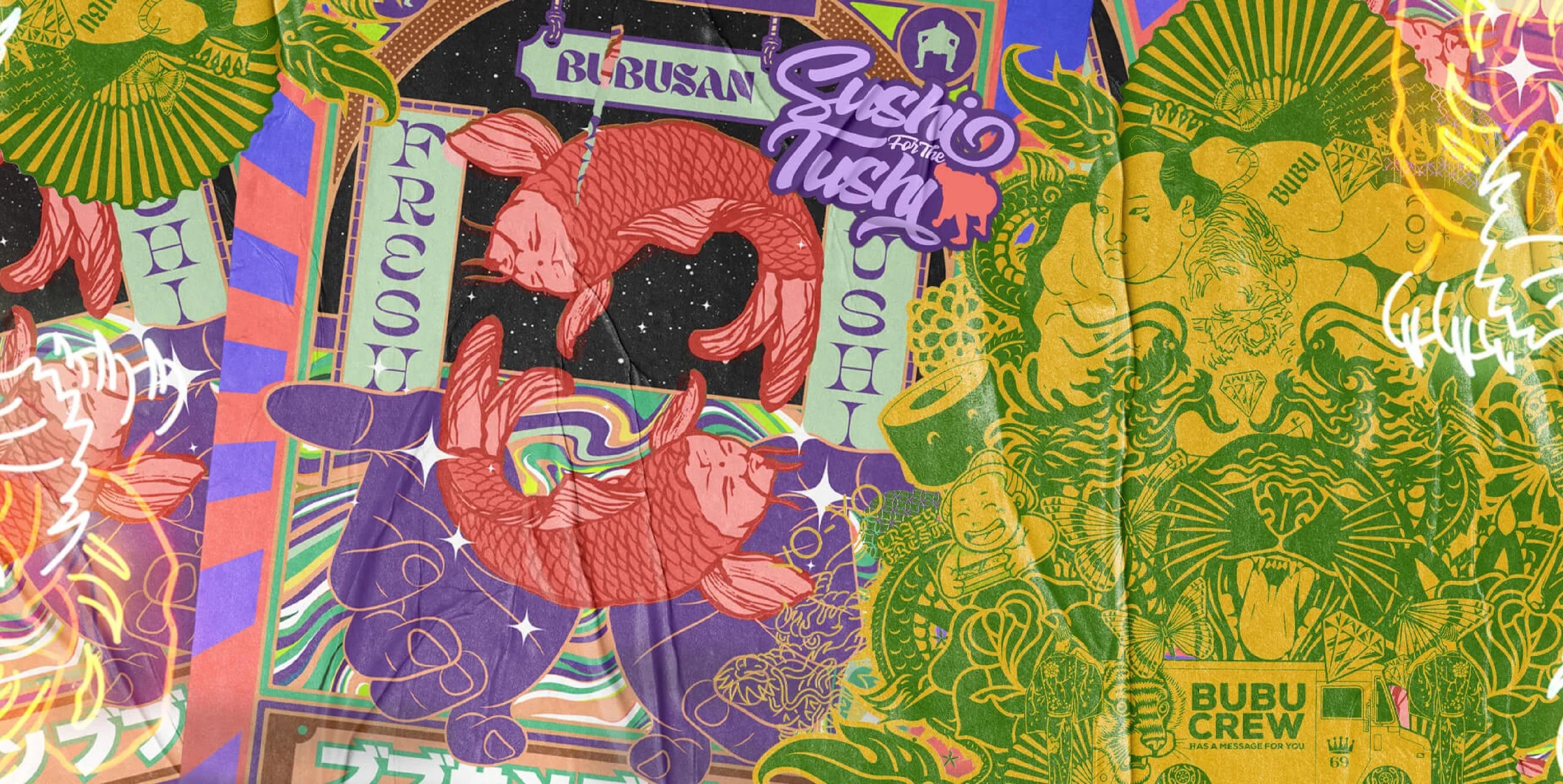
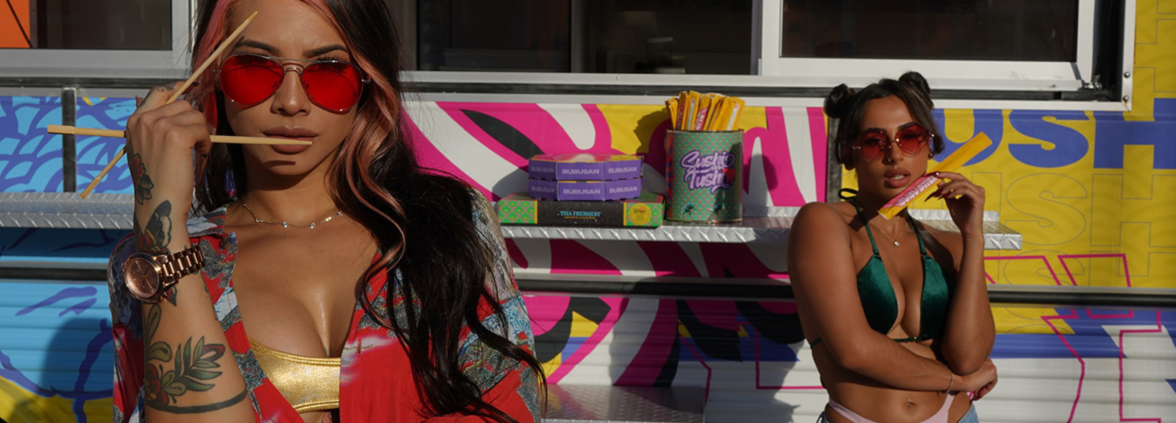
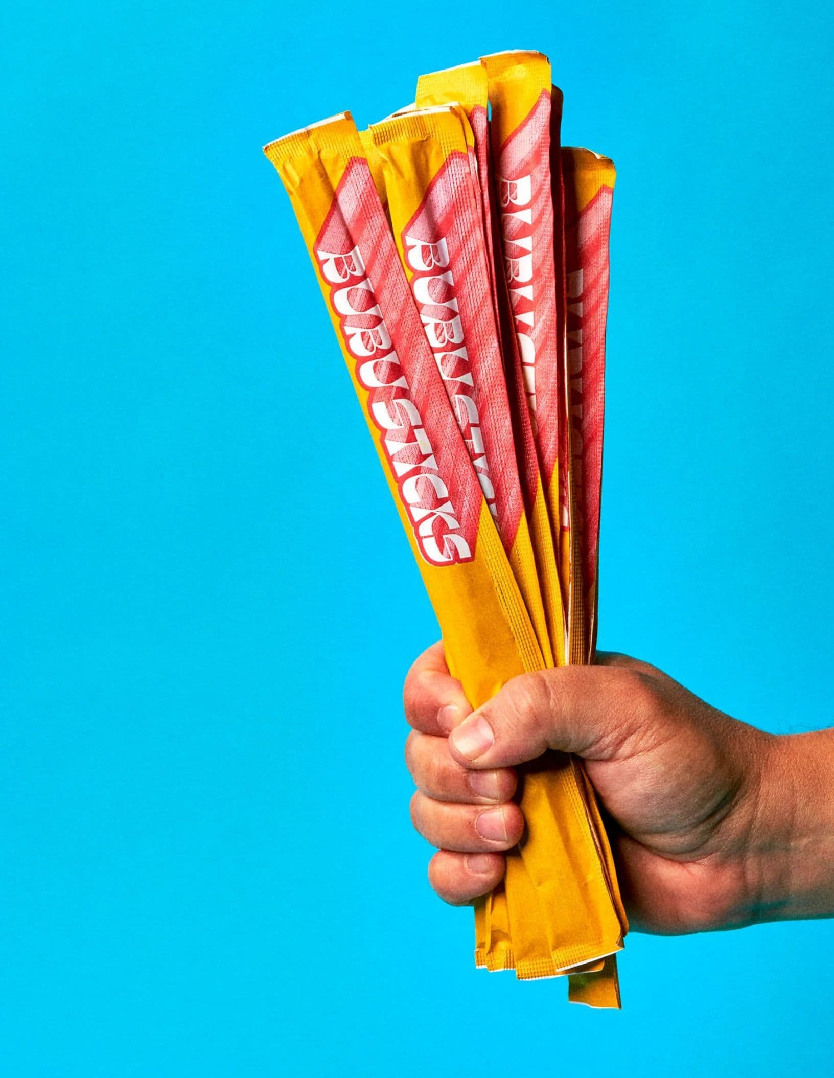
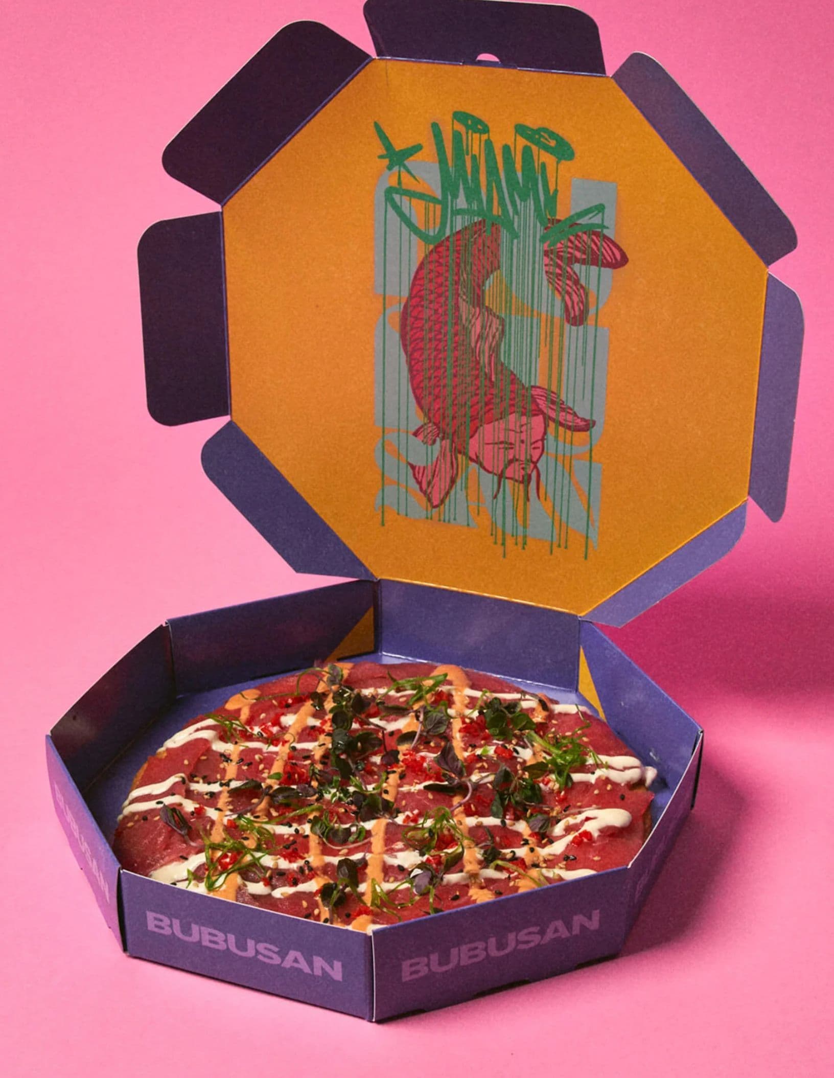
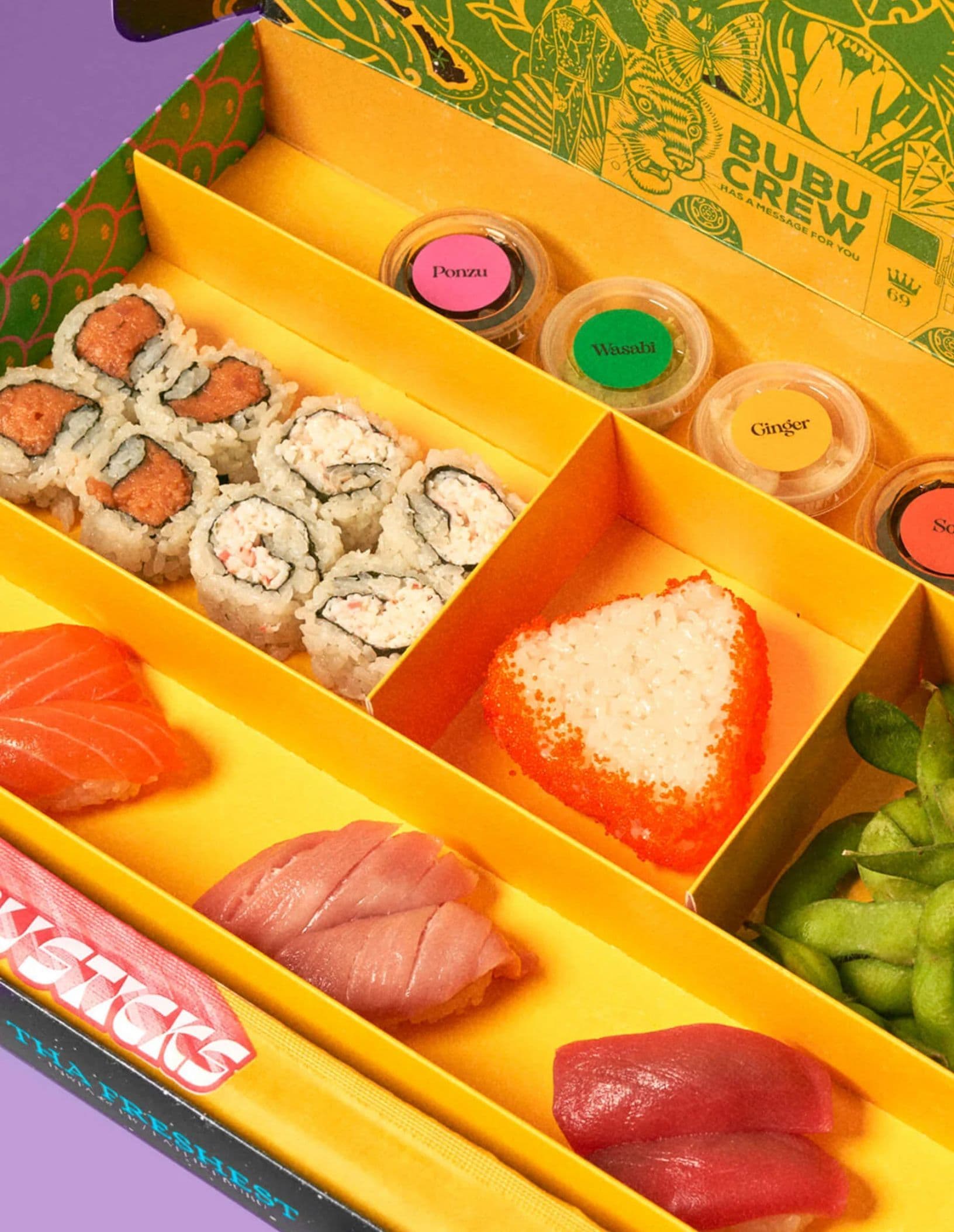
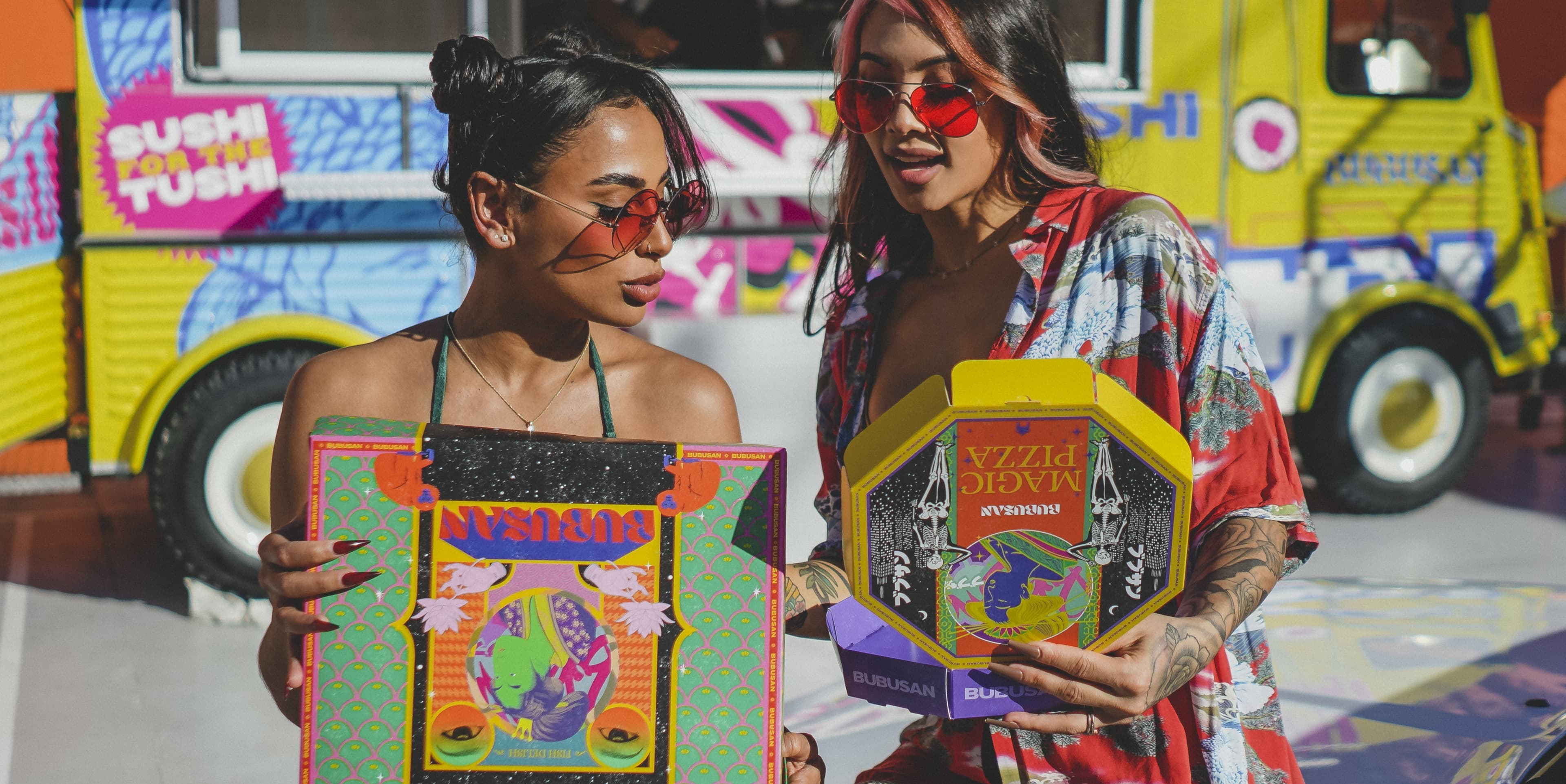
With dine-in service off the table, packaging became the hero. I led the brand strategy and visual identity and design, with a specific focus on creating high-impact packaging design that could drive social engagement and unboxing excitement. I wanted the experience to start not at the table, but at the doorstep—transforming sushi delivery into a shareable, design-forward moment.
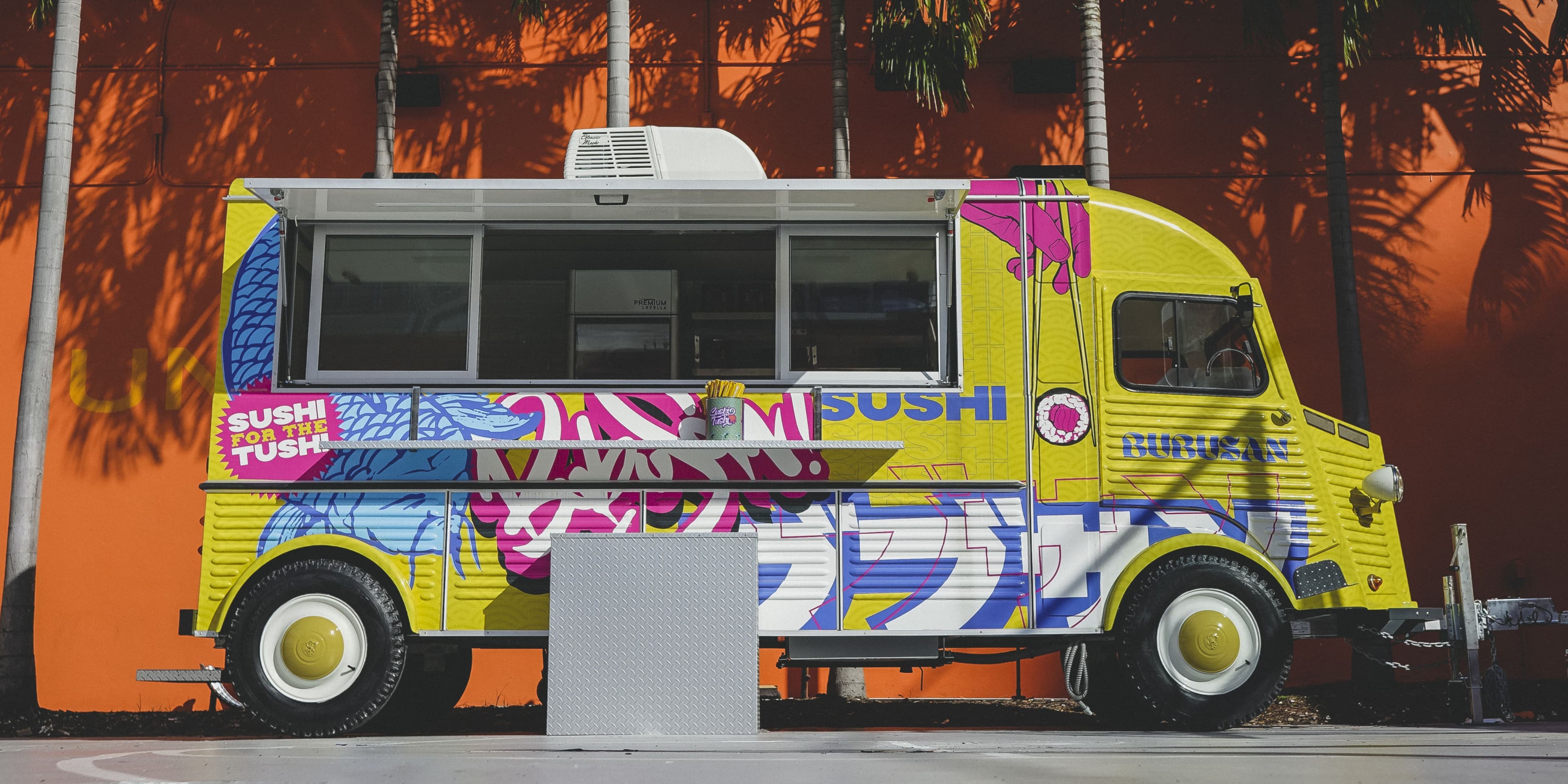
The bold visual direction was cheeky, bright, and irreverent—everything AZABU isn’t, by design. That contrast worked. BUBUSAN quickly gained traction, boosted visibility through social media, and most importantly, kept the doors open and teams employed during one of the most brutal years for the restaurant industry.
Short-lived by intention, the project served its purpose. A creative, brand-smart lifeline that proved how design and strategy can sustain not just a product, but a people-first mission during crisis.
View the site
eatlikebubu.com
“I was so taken back when I got the first look at what BUBUSAN would be.
Alex did an incredible job brining this to life.”
Mahmood Abousalem
Vice President | PDS Hospitality
